")

Click the button to start reading
Team Dashboards That Don’t Suck: Making Metrics Useful (Not Overwhelming)
You open the dashboard and—bang—numbers everywhere. Instead of clarity, you get cognitive whiplash.
The solution isn’t more data; it’s better-curated data delivered in a format that sparks action.
This guide shows you exactly how to create motivating, visual, low-effort dashboards your team checks because they want to, not because they have to.

1. Flip the Script: Dashboards as Coaching Tools—Not Report Cards
Traditional dashboards feel like permanent report cards—static, judgmental, and rooted in yesterday.
Useful dashboards behave more like coaches: showing real-time progress, suggesting next moves, and highlighting win-streaks to keep spirits high. To make that leap, every widget must answer one of three questions:
- Where are we? (Progress toward a clear, time-boxed goal)
- What just happened? (Fresh signal vs. noise)
- What do we do next? (Decision prompt with ownership)
If a tile on your dashboard can’t pass that quiz, it’s probably vanity data begging for exile. Resist the urge to “just add one more chart”—every addition dilutes attention and slows reaction time.
Psychology Check: Loss Framing Beats Vanity Glows
Teams act faster when the cost of inaction is visualized. For instance, a live “leads lost this week” counter often galvanizes sales reps more than a static “pipeline value” bar.
Frame the metric so the gap between reality and ambition feels solvable—then watch ownership surge.
2. Pick Metrics Your Team Can Influence—Today
Lagging indicators—quarterly profit, annual churn—are important, but they don’t empower daily action. High-utility dashboards favor leading indicators within arm’s reach, like:
- Story points closed per sprint (engineering)
- Demo-to-opportunity conversion rate (sales)
- Ticket resolution time under 24 h (support)
When teammates see a dial they can nudge this week, energy levels climb. Confidence follows.
As a rule of thumb, any metric that can’t move at least 1% in five working days is too sluggish for the main board—relegate it to a monthly exec snapshot instead.

3. Design Rules for “Glance-ability”
Think Billboard, Not Spreadsheet
People driving 70 mph have six seconds to digest a billboard. Treat your dashboard the same way. Follow these visual heuristics:
- One idea per tile. No split-axis charts—ever.
- Left-weighted layouts. Western eyes read left-to-right; place critical metrics on the left column or top row.
- Traffic-light logic. Green = good, yellow = pay attention, red = act now.
- Sparklines over big charts. Show direction in two inches, not 200 rows.
- Whitespace is oxygen. Leave breathing room so each figure feels clickable, not crammed.
Visual Hierarchy Hacks
Hierarchy isn’t just font size—it’s spatial priority. Anchor “North-Star” tiles in the upper left, supporting metrics below, and experimental tiles on the far right. This predictable map helps new hires orient in minutes.
4. Automate Updates in 15 Minutes or Less
A dashboard that demands heroic spreadsheet marathons is a dashboard destined for abandonment. Borrow this three-step automation ladder:
- Connect. Pipe data straight from your source of truth—CRM, project tracker, or ad platform—into the dashboard tool. Avoid manual CSV exports whenever possible.
- Clean. Automate field mapping and naming conventions once. Schedule a weekly data hygiene reminder so anomalies don’t snowball.
- Curate. Use formulas or calculated fields to surface composite scores (e.g., Engagement Index). Version-control formulas so everyone trusts the math.
A scrappy startup can wire this in Looker Studio or Power BI, but if you’d rather skip the duct-tape phase, Teamly bundles live data pulls, role-based permissions, and automatic annotation—all shaving hours off weekly upkeep.

5. Tool Selection: Match Muscle to Mission
The slickest BI platform is useless if your team dreads opening it. Evaluate tools with the F-C-A test:
- Friction: How many clicks from login to insight? < 3 is ideal.
- Customization: Can non-developers add a tile in < 10 minutes?
- Adoption: Does the tool integrate notifications where your team already lives—Slack, Teams, email, mobile push?
Run a 30-day bake-off: invite two cross-functional squads, let them build identical dashboards in competing tools, and measure setup time, engagement, and aha moments. The numbers will pick the winner for you.
6. Case Study: From Data Swamp to Clarity in 21 Days
Scenario: A 40-person SaaS team battled 17 different dashboards. Meetings devolved into metric debates. The ops lead launched a “Data Detox” initiative:
- Inventory: listed every metric across the org—217 total.
- Score: rated each 1–5 on actionability and ownership.
- Purge: kept the top 25 tiles (≈12%).
- Re-launch: deployed a single, five-page dashboard—Personal, Squad, Exec, Product, Growth.
Results: Stand-up duration dropped 30%. Time-to-decision on roadmap items shrank from 10 days to 4. NPS among engineers rose 9 points, attributing morale boost to “less data noise.” All in three weeks—with no new headcount.
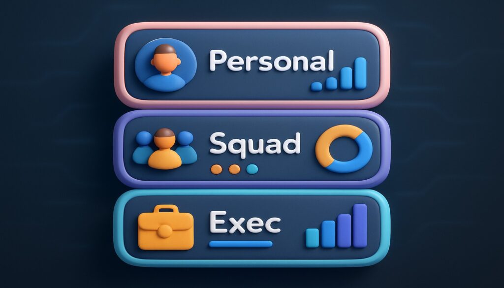
7. Create Three Levels of Visibility
Level 1: Personal Pulse
A slim mini-dashboard each teammate sees first thing Monday. Only their top three metrics appear. Goal: self-management and weekly clarity.
Level 2: Squad Status
Weekly stand-up or retro uses a shared view. Tiles show aggregate velocity, blockers, and highlights. Goal: collaboration and cross-functional accountability.
Level 3: Exec Snapshot
Monthly or quarterly roll-up designed for five-minute consumption by leadership. Mix KPIs with narrative context in annotation boxes. Goal: strategic decision-making without drowning in detail.
By tiering visibility, you prevent context-switching chaos and keep each audience zoomed at the perfect altitude.
8. Measure What You Can’t See: Process Health Tiles
Hard metrics dominate dashboards, yet process health often drifts into hallway chatter. Add qualitative proxies to spotlight hidden friction:
- Slack Responsiveness Index: Median time to reply in mission-critical channels.
- Meeting Density Map: Hours spent in meetings vs. focus time.
- Bug-to-Feature Ratio: Flags when quality debt creeps above tolerance.
These meta-metrics surface cultural bottlenecks before they calcify.
9. Advanced Visualization Flourishes (Without Overkill)
- Animated Trend Arrows: Subtle up- or down-chevrons that pulse when shifts exceed 5%.
- Goal Thermometers: For fundraising or backlog burn-down, a mercury-style indicator is instantly legible.
- Drill-through Mini-Cards: Click a tile to reveal context in a side panel instead of navigating away.
Use flourishes sparingly—each should accelerate comprehension, not showcase your chart wizardry.
10. Bake Dashboards into Rituals—Not Just Links
The deadliest phrase in analytics? “The link is in the wiki.” A dashboard only lives when wrapped inside a ritual:
- Stand-up Starter (5 min): Each teammate calls out one metric shift and next tiny action.
- Mid-sprint Health Check (10 min): Scrum Master screenshares velocity tiles and backlog trends.
- Monthly Metrics Montage (15 min): Team lead walks through accomplishment badges and improvement targets.
When dashboards power conversations, data literacy rises and surprise-free cultures flourish.
11. The Low-Effort Dashboard Blueprint (Copy & Paste)
Need something in place this week? Borrow this skeleton:
| Tile | Why It Matters | Refresh Cadence |
|---|---|---|
| North-Star KPI | Single success beacon (e.g., Weekly Active Users) | Daily |
| Leading Metric 1 | Early signal you can influence (e.g., Signup-to-Activation Rate) | Daily |
| Leading Metric 2 | Complementary early signal (e.g., First Response Time) | Daily |
| Win Snaps | Automated feed of shout-outs or success stories | Live |
| Risk Radar | List of items breaching thresholds | Live |
Hook those five widgets into your tool of choice, add threshold coloring, and you’re operational by Thursday.

12. Quick-Start Templates for Popular Roles
Product Manager
- Activation Funnel Drop-off
- Feature Adoption Heatmap
- Customer Feedback Sentiment
Marketing Lead
- Cost per Qualified Lead
- Channel-wise CAC vs. LTV
- Campaign-level ROAS Trend
Customer Success
- Churn Risk Cohort
- NPS Trendline with Annotations
- First Contact Resolution Rate
Use these as plug-and-play tile packs for lightning-fast adoption.
13. Data Ethics: Build Trust Before You Build Charts
Dashboards expose raw performance. Without psychological safety, visibility can morph into surveillance. Protect trust by:
- Explaining intent: Clarify how each metric helps the individual win.
- Limiting PII: Aggregate where possible; anonymize where helpful.
- Inviting edits: Let teammates flag tiles that feel misaligned or de-motivating.
Transparency is a two-way street: share not just the numbers but the why behind them.
14. Remote & Hybrid Teams: Extra Dashboard Boosters
Distributed squads lose hallway context, so dashboards become the digital watercooler. Layer on these boosters:
- Timezone-aware snapshots: Show yesterday’s cut at midnight in each region.
- Emoji reactions: Allow quick applaud or concern signals without starting a thread.
- “Explain This” buttons: Auto-generate a short Loom or text explainer for new hires.
15. Keep Iterating with “Tile Re-Runs”
A stale dashboard quietly kills motivation. Schedule a quarterly Tile Re-Run—a 30-minute meeting where each widget must justify its existence. Ask:
- Did this tile drive at least one decision last quarter?
- Can the metric be gamed? If yes, replace or refine.
- Would our work suffer if it disappeared? If no, delete.
The ceremony is fast, playful, and prevents entropy from creeping into your visual stack.
16. FAQ: Your Pressing Dashboard Questions—Answered
“How many tiles are too many?”
Aim for a “nine-tile rule” on any single screen. Beyond nine, cognitive load spikes. Collapse extras into drill-downs.
“Should I include financials on the team board?”
Yes, if they inform daily behavior and the team can influence them. Otherwise, park them in the exec snapshot.
“What about red-amber-green fatigue?”
Swap the entire color palette quarterly or switch from fills to border cues to reset attention.
17. Your Next Step: Ship a Minimum Lovable Dashboard
You now have the playbook: influential metrics, billboard design, turnkey automation, ritual integration, ethical safeguards, and ruthless upkeep.
The only missing ingredient is momentum.
Carve out two hours, grab the blueprint above, and ship a minimum lovable dashboard this week. Watch how quickly engagement spikes when data finally feels like a teammate—not an overlord.