Open the analytics tab and boom—a glitter bomb of charts detonates on your screen.
Pageviews, churn, MRR, DAU, NPS, CPL… every acronym waving its arms like a kid on the last day of school. No surprise your people can’t decide what really matters.
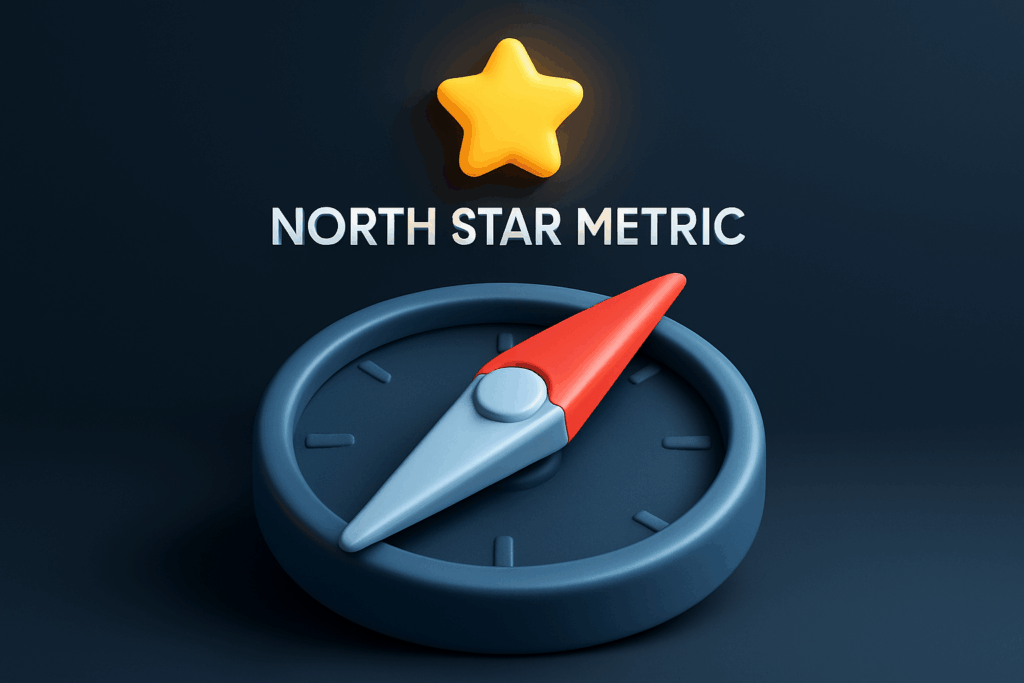
This guide digs two layers deeper than a typical KPI article, showing exactly how to excavate a single, story-worthy metric that aligns every sprint, meeting, and victory dance.
You’ll walk away with neuroscientific proof, real-world case studies, agenda scripts, DIY templates, and advanced tricks for keeping the metric beating long after kickoff. Ready? Let’s get focused.

Part 1 — The Hidden Costs of Metric Mayhem
1.1 Cognitive Overdraft Fees
Your prefrontal cortex can juggle roughly seven items total, and that includes what’s for lunch. Sprinkle in three dashboards’ worth of numbers and you’ve got a mental debt spiral called decision fatigue. Judgments slow, creativity plummets, and tiny trade-offs start feeling Everest-big.
1.2 Incentive Whiplash
If marketing’s north star is top-of-funnel leads but sales lives or dies by qualified pipeline, each team drives with one foot on the gas and one on the brake. Energy dissipates in turf wars instead of compounding into growth.
1.3 Opportunity Fog
The more numbers you watch, the harder it is to spot the rogue spike worth pouncing on. Imagine trying to see a lighthouse through fireworks—glittery distractions blind you to real danger (or fortune) ahead.
“Confusion is the enemy of execution. Complexity kills momentum faster than a missing budget.” — Modern Leadership Proverbs, Vol III*
*Okay, that volume is imaginary, but the wisdom holds.
Part 2 — Anatomy of a True North-Star Metric
2.1 Four-Point Litmus (Revisited)
- Customer value: Rising metric = louder cheers from users.
- Revenue resonance: Dollar signs follow sooner rather than later.
- Weekly malleability: Your crews can nudge it within five working days.
- Bumper-sticker clarity: Everyone can quote it in the elevator.
2.2 The Villain Filter — 7 Deadly Sins Redux
We introduced these earlier; now steal this printable poster (retro style) and tape it to your war room wall. Any metric committing one sin gets exiled.
- Vanity – stroking ego, not impact.
- Lag – weeks late to the party.
- Fraud – easily gamed or botted.
- Isolation – no team can influence it.
- Obscurity – needs footnotes.
- Stagnation – barely budges.
- Irrelevance – customers yawn.
2.3 Whole-Team Litmus Exercise (15 min)
- Print each candidate metric on a sticky.
- Have every person tag any sin they spot.
- If a sticky collects three or more sins, shred it. Drama = memorable.
Part 3 — Case Files: Three Companies, Three North Stars
Case A — FreightTech Startup: “Loads Delivered per Day”
A seed-stage SaaS helping truckers book jobs measured sign-ups at first. Revenue plateaued. Switching to “loads delivered/day” shifted product focus toward post-booking features—route optimization, fuel cards—and lifted retention 38 % in two quarters.
Case B — Nonprofit EdTech: “Weekly Learning Minutes per Student”
An education charity originally tracked school onboardings (vanity). They pivoted to “learning minutes”; donors loved tangible impact, and teacher engagement doubled. Bonus: content team now designs micro-lessons to nudge the number.
Case C — DTC Coffee Brand (Hello, Lifeboost!): “Repeat Purchases within 60 Days”
Caffeine merchants often obsess over CPA. Instead, our friends at Lifeboost (yep, the ones using Teamly to track creative tests) focus on “repeat purchases/60 days.” That keeps acquisition, email, and product teams aligned on retention quality, not just first-cup seduction.
Part 4 — OKR-Lite, Expanded Edition
4.1 Anatomy of a Sharp Objective Statement
Objective: Make productivity habits contagious.
Key Result (North Star): Increase Weekly Active Workspaces from 12 k → 25 k by Dec 31.
The Tightrope Test
If the objective is inspirational but the metric is surgical, you nailed it. Too vague? Rewrite. Too granular? Zoom out.
4.2 Driver Metrics—Your Three Boosters
Think of the north star as orbit altitude; drivers are thrusters:
- Driver 1: Invites sent per workspace
- Driver 2: First-week task completions
- Driver 3: Active mobile sessions
Post each driver next to its owner in Teamly so accountability clicks into view—literally.
4.3 Road-Mapping Backwards (Milestone Math)
Say you need 13 k net new active workspaces in 26 weeks. That’s 500 per week. Factor churn (5 %). Total required adds: 525/week. Now slot quarterly initiatives until that weekly number feels inevitable.
# sample SQL to audit weekly gains
SELECT
  DATE_TRUNC('week', activated_at) AS week,
  COUNT(DISTINCT workspace_id) AS new_workspaces
FROM workspace_activations
WHERE activated_at BETWEEN '2025-07-01' AND '2025-12-31'
GROUP BY 1
ORDER BY 1;
Not a SQL shop? Teamly’s Reports tab visualizes the same thing—minus the semicolons.

Part 5 — The Neuroscience of Focus: Making Metrics Sticky
5.1 Dopamine Loops
Every time your team sees that number inch upward, a micro-dose of dopamine fires. Stack enough micro-wins and you’ve got compounding motivation.
5.2 Social Proof & Competition
Humans mirror peers. Post leaderboards that show which squad moved the needle most this week. Friendly bragging rights = free fuel.
5.3 Loss Aversion Nudges
People fear losing status more than gaining it. Showcase a downward blip in red italics and watch Slack flare with solutions.
Design Tip
Use #00b894 for up, #d63031 for down. Keep all other numbers gray to starve distractions.
Part 6 — Instrumentation & Data Hygiene (a.k.a. “Counting It Right”)
6.1 Event Mapping Workshop
Map out every user action feeding the metric. Use a whiteboard or a Teamly task board:
- Define canonical event names (no more
signupvs.registerchaos). - Set trigger conditions and property payloads.
- Audit each platform (web, iOS, Android) weekly for schema drift.
6.2 Tool Stack Essentials
| Need | Recommended Tool | Why |
|---|---|---|
| Event tracking | Segment | One pipe to rule them all |
| Warehouse | Snowflake / BigQuery | Scale without sleepless engineers |
| Visualization | Looker / Metabase | Build self-serve dashboards |
| Collaboration | Teamly | OKR-lite boards + automated nudges |
6.3 Golden Query Check
Every Monday, run your “golden query” (one SQL file or Looker tile) to verify row counts match the BI dashboard display. If off by >1 %, pause campaigns until fixed. Nothing kills credibility like a wobbly number.

Part 7 — Rituals That Keep the Metric Breathing
7.1 Daily Pulse (5 min stand-up segment)
- Metric posted as emoji: 📈 / 📉
- Owner states one driver that influenced yesterday’s move.
- Anyone may ask one clarifying question. Then stop—momentum over meetings.
7.2 Friday Win-Loss Retro
- Celebrate top contributor (with GIFs, obviously).
- Surface a blocker that hindered progress.
- Commit to one micro-experiment for next week.
7.3 Quarterly Campfire
Gather the whole company (remote? use Zoom + Miro). Leadership tells a story of how the metric evolved—complete with customer quotes, product screenshots, revenue graphs. Numbers + narrative = memory glue.
Part 8 — Troubleshooting Guide: “Our Metric Is Drooping—Now What?”
- Isolate the Dip: Slice by segment, cohort, geography. Often one pocket hides the leak.
- Check Instrumentation: Was a tracking event renamed in last release?
- Correlate Drivers: Did an input KPI tank? Example: invite sends fell 22 % post-holiday.
- Run Two Tiny Experiments: Ship both within 48 hours to test hypotheses.
- Broadcast Learnings Fast: Even if results are inconclusive, share them—transparency beats rumor mills.
The “Four-Up” Board
Create a Teamly board with columns: Signal, Suspect Cause, Fix in Flight, Learning Logged. Update live during the dip week.

Part 9 — Advanced Plays for Mature Teams
9.1 Shadow OKRs
Keep a secret “stretch” version of the metric visible only to leadership. If hit early, publicly unveil and ignite the next sprint without resetting morale.
9.2 Metric-A-Month Experiments
Rotate focus to a secondary metric each month without losing sight of the north star. Great for surfacing new growth levers.
9.3 Driver Guardrails
Pair every input KPI with a quality guardrail. Example: increase invite sends while keeping spam reports below 0.2 %. Prevents “gaming” the main stat.
9.4 Cohort Heat-Maps & Survivor Curves
Plot new-user cohorts against retention at weeks 0-12. Any curve flattening below target signals activation friction. Color-code by acquisition channel for aha! moments.
9.5 Predictive Scoring
Build a lightweight regression to forecast north-star movement three weeks out based on driver inputs. Even a rough model helps prioritize experiments proactively.
# tiny Python pseudocode snippet
import pandas as pd
from sklearn.linear_model import LinearRegression
X = df[['invites_sent','feature_act','mobile_sessions']]
y = df['weekly_active_workspaces']
model = LinearRegression().fit(X, y)
print(model.coef_)
Part 10 — One Metric to Rule Them All (Wrap-Up, No Fluff)
Complexity begs for clarity. When your company salutes a single, purpose-packed metric, meetings shrink, debates sharpen, and progress accelerates. Gather the brain trust, run the litmus, crown your north star, and tattoo it on the org’s heartbeat. Then let Teamly keep the drumbeat rolling.
Focus is rocket fuel—hand it the launch code and buckle up for lift-off.